Steven Walbrick
Designing with a painter’s eye and a strategist’s mind—blending creativity, functionality, and human-centered thinking to craft seamless digital experiences.
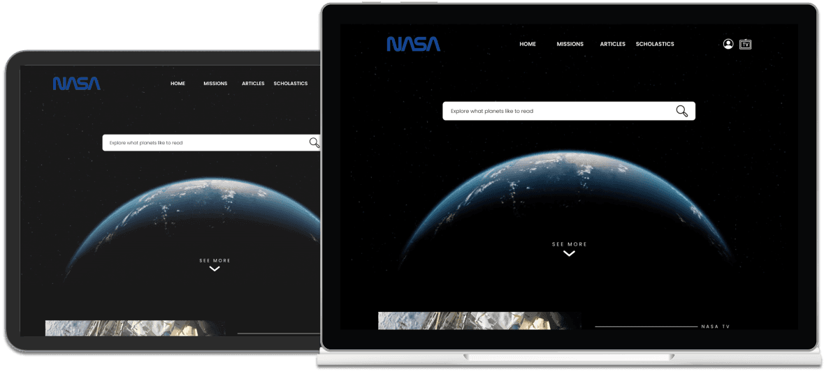
nasa
NASA is the United States government agency responsible for space exploration, scientific discovery, and aeronautics research. They offer a wealth of educational content for teachers and students, including lesson plans, STEM activities, and interactive resources.
summary
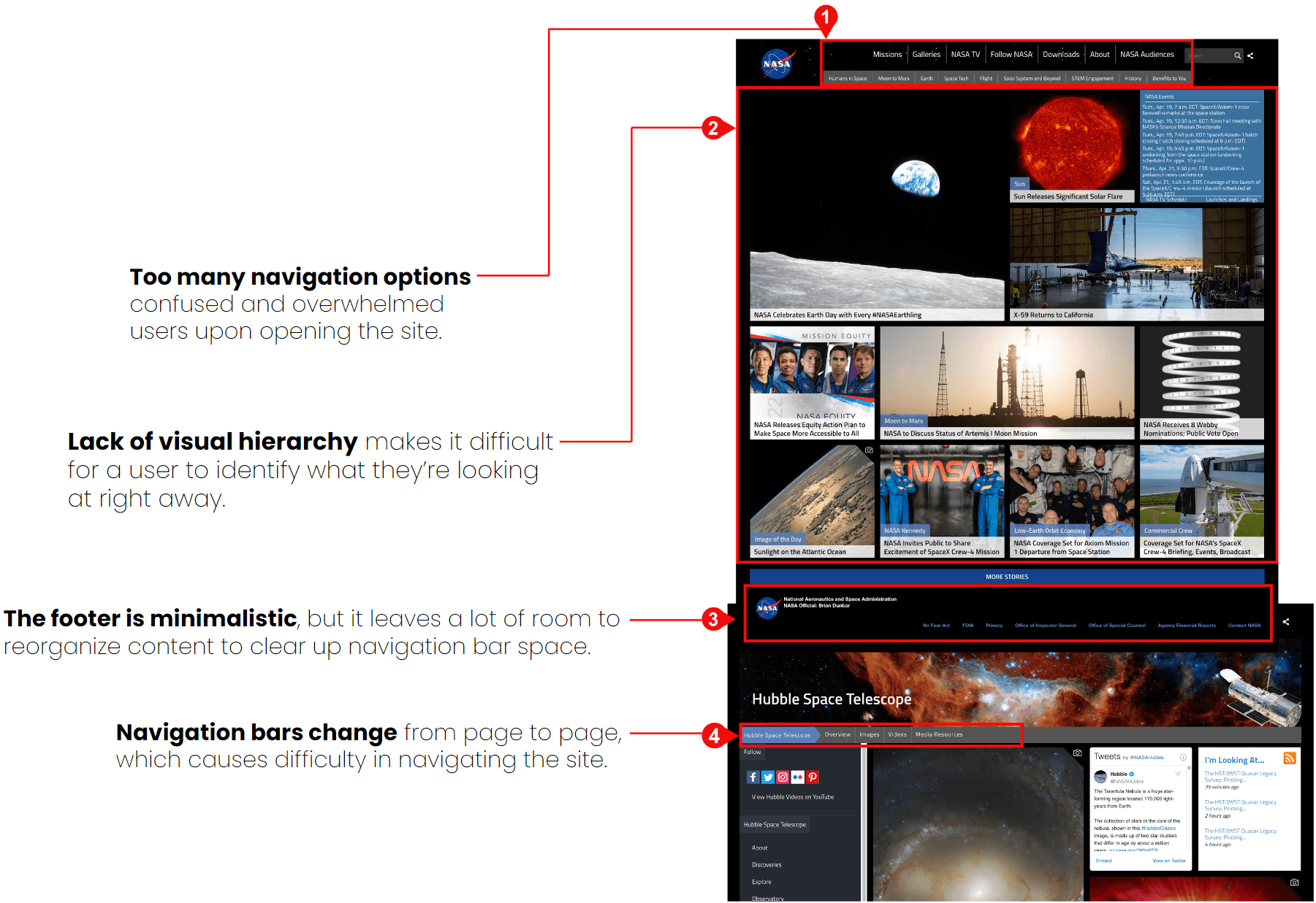
Before the NASA website redesign, students and teachers struggled to engage with educational resources due to a cluttered layout, poor navigation, and limited mobile accessibility, leading to frustration and decreased utilization of valuable content.
Role
UX/UI Design Student
Team
UX/UI Designers
Developers
Goals
Improve resource accessibility: Streamline the navigation and organization of educational materials to make it easier for students and teachers to find relevant content quickly.
Enhance user experience: Modernize the website layout and interface to create a more intuitive and user-friendly experience, reducing frustration and time spent searching for resources.
Boost engagement with interactive tools: Integrate more engaging and interactive educational tools, such as videos, simulations, and quizzes, to foster active learning.
Improve content discoverability: Implement better search functionality and filtering options, enabling users to easily locate specific lesson plans, topics, or activities.
Research
Through market research, competitive analysis, and user interviews, we set out to gain a deeper understanding of NASA’s users.
Through our research, we wanted to:
Identify NASA’s target market.
Identify NASA’s competitors and evaluate their strengths and weaknesses.
Understand the experiences people have when using NASA’s website.
Discover the goals, needs, motivations, and dissatisfaction of NASA users.
competitor analysis
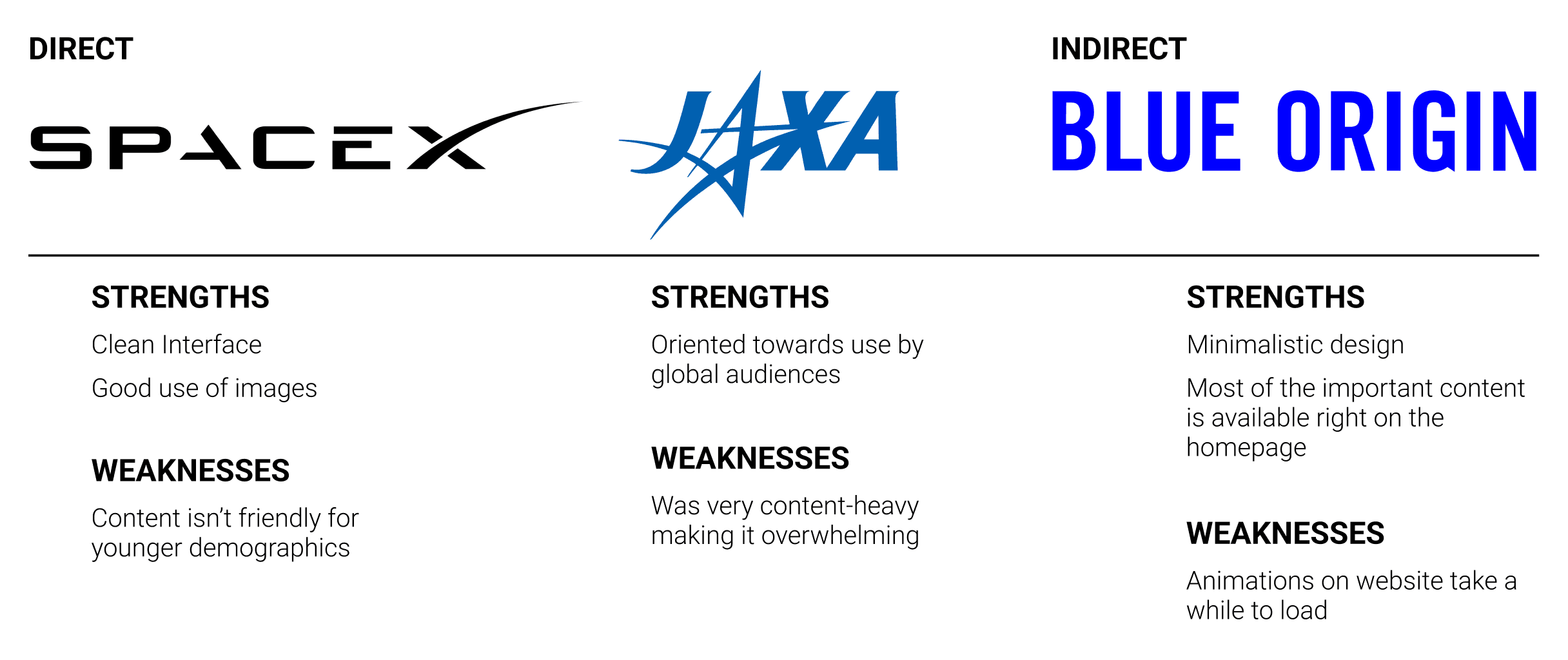
We started to research NASA’s competitors so we could evaluate their strengths and weaknesses. The insights gained here provided key information in terms of the strengths we want to build upon and the weaknesses we want to avoid while keeping NASA’s specific goals in mind.
User Interviews
During these interviews, we asked open-ended questions to learn as much as we could about their experiences and identify what the user’s needs truly are.
We conducted interviews with 5 people, about 3-5 minutes each. Some questions asked during the interview:
Tell me about the steps you take to gather sources for a research paper.
What websites do you find reliable in regard to educational material, and why?
How are you screening your sources?
How much time does it typically take for you to locate the information that you're looking for on a website?
After conducting these one-on-one sessions with the participants, we wanted to take all this new information gained and synthesize it to better understand who the users are.
empathy map
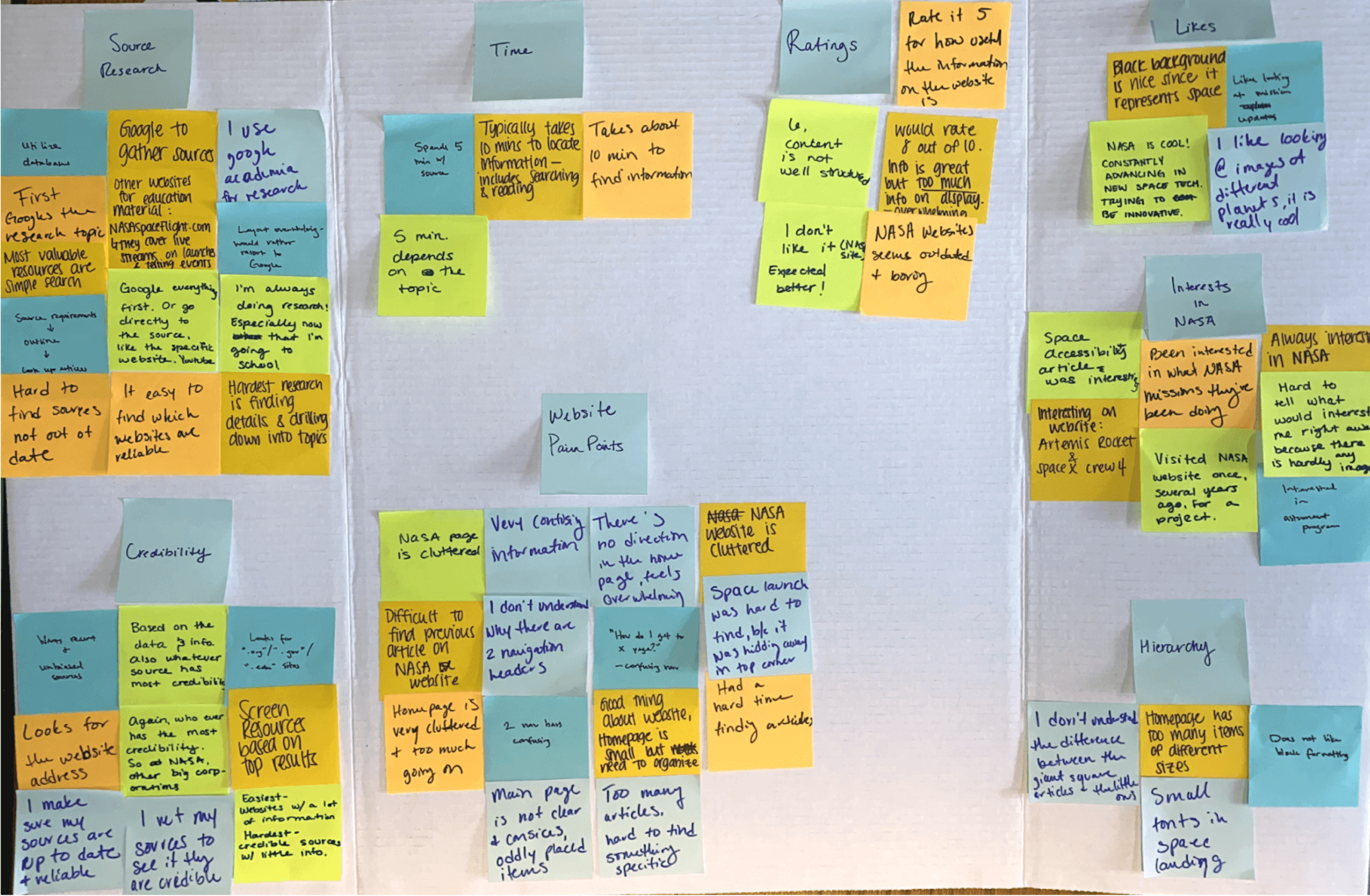
Using an empathy map, we synthesized all the information we gathered during the user interviews to uncover key insights that led to identifying NASA’s target user group. First, we started by categorizing our notes into the categories of Time, Credibility, Pain Points, Source Research, Likes, Interests in NASA, Ratings, and Hierarchy to get an overall understanding of everything learned during our interviews with the different participants.
insights
People spend about 5-10 minutes researching on average.
People won’t use a website that’s cluttered with information.
Use the search bar to find specific topics for information.
needs
To be able to filter content with ease.
To be able to find what they’re researching very quickly.
A search feature on the website lets the users locate what they’re looking for.
user persona
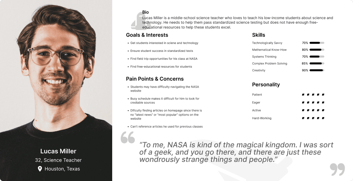
Through our secondary and primary research, we were able to get a clear picture of who NASA’s target users are and create a persona that would accurately represent them - meet Lucas Miller! This persona continued to guide our decisions moving forward, making sure our design is centered on who our user Lucas is.
user insight
Now with our understanding of NASA’s user, Lucas, we wanted to start thinking about what problems we are trying to solve for him. Taking the insights and needs from the empathy map, we started to dig deeper to better understand what Lucas’ problems are by creating a user insight.
Lucas Miller is a middle-school science teacher who loves to teach his low-income students about science and technology. He needs to help them pass standardized science testing but does not have enough free-educational resources to help these students excel.
problem statement
Going off our user insight we started brainstorming what our problem statement could be, and its solution.
Lucas Miller, a struggling science teacher, is frustrated locating quality material for teaching and is desperate to find a user-friendly database because his school cannot afford adequate materials. How might we improve the structure of NASA’s content to provide a learning environment to foster academic success?
site map
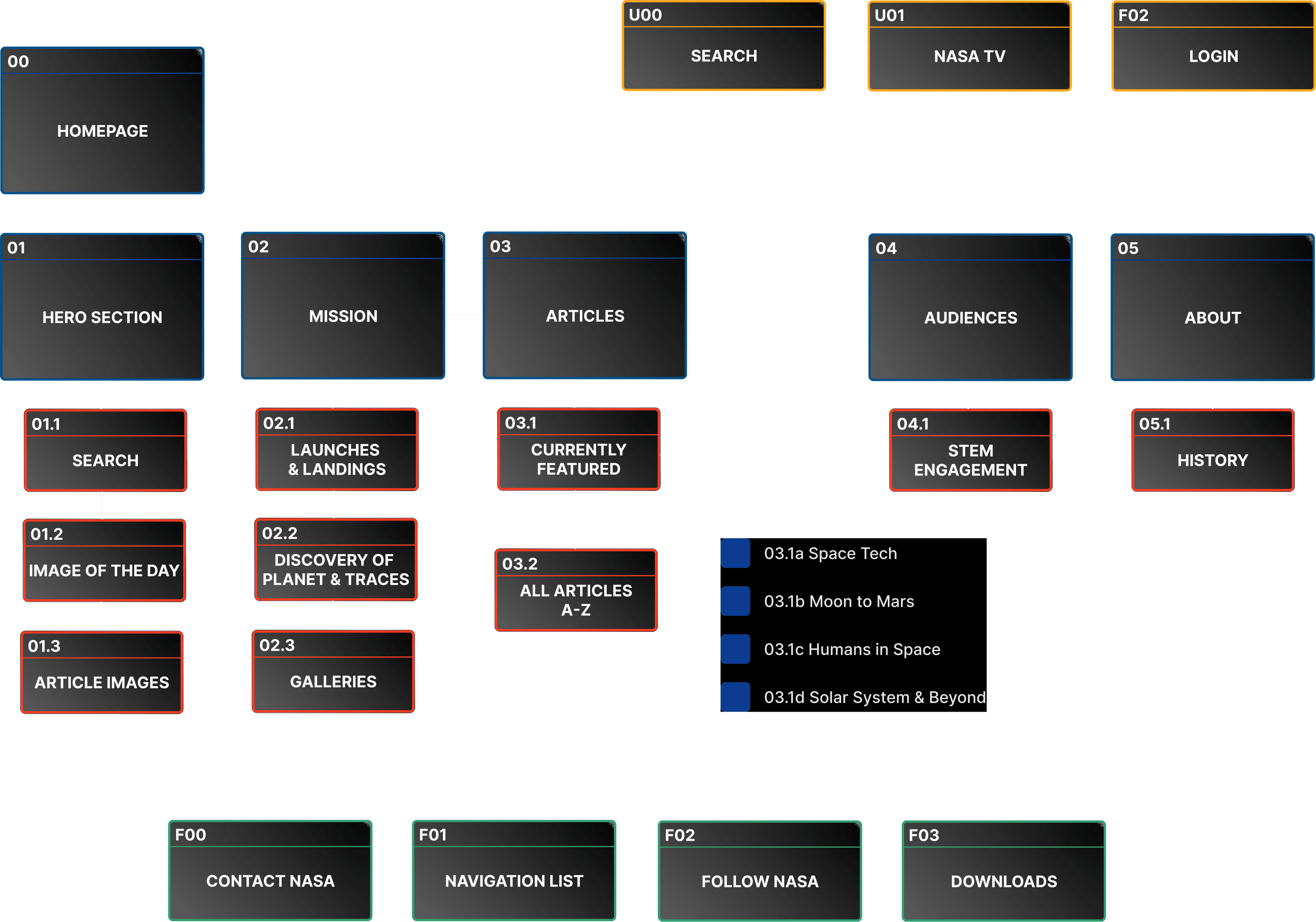
Focusing on the prioritized solutions, we created a site map to help define the overall structure of the content on NASA’s website in a way that would be logical and easy to navigate for our user.
lofi wireframe sketches
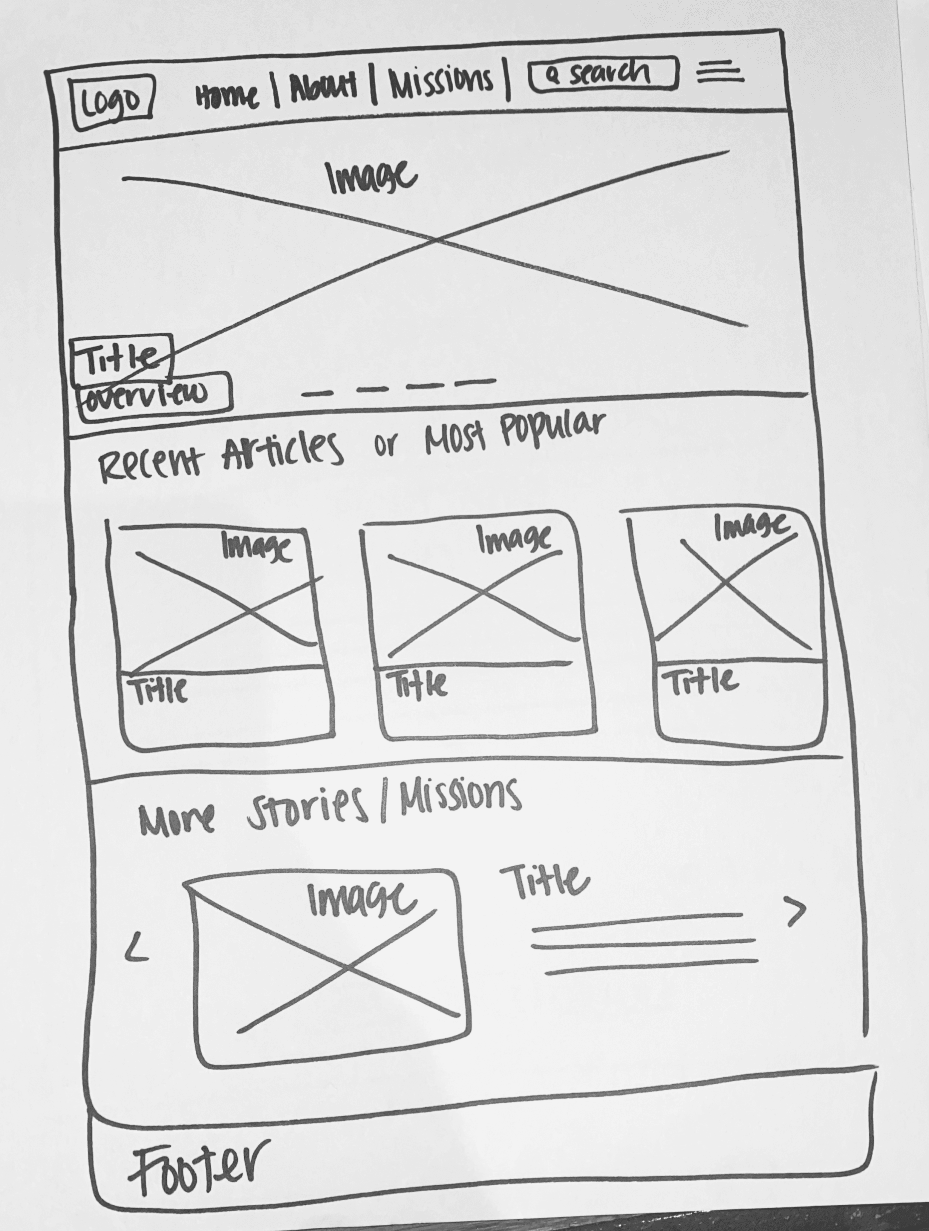
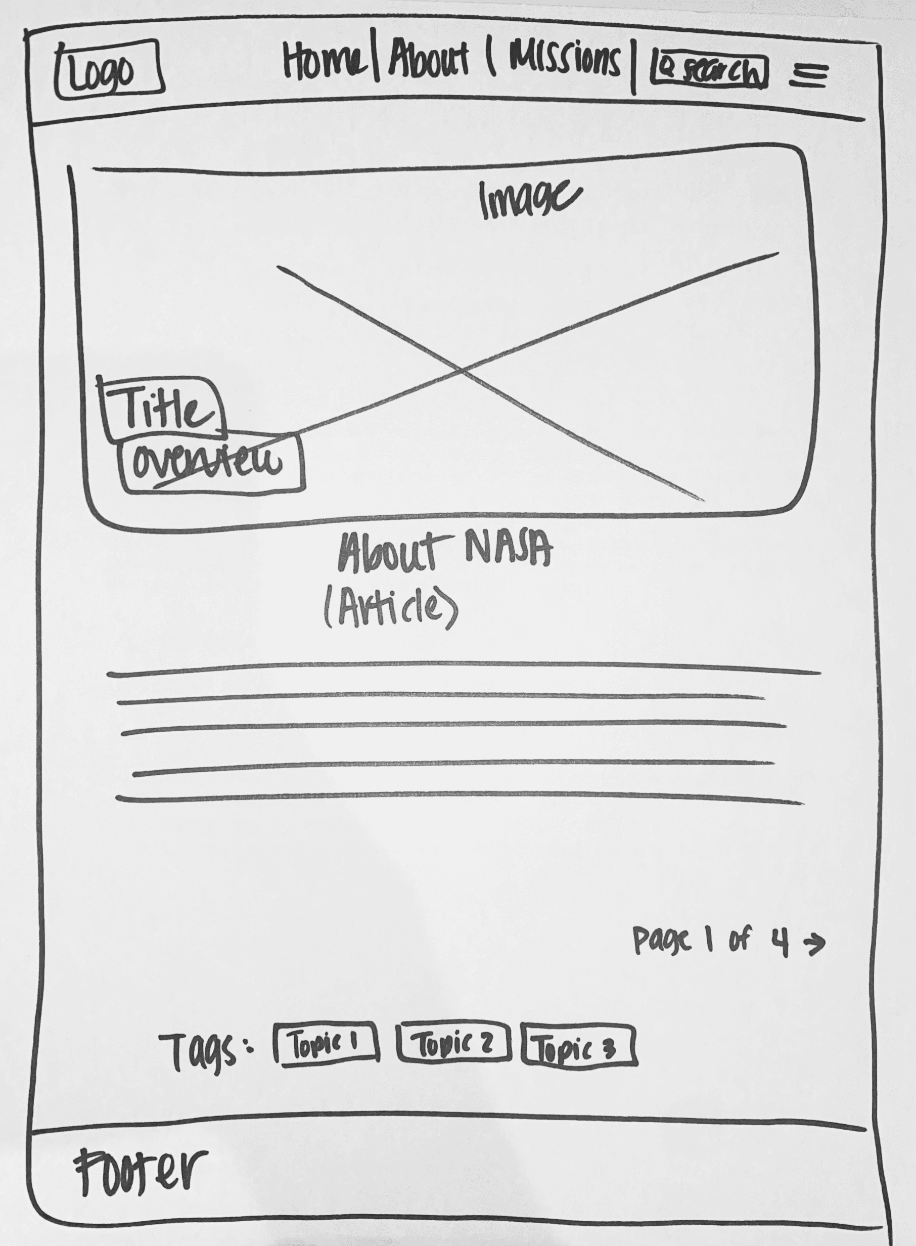
Taking what we have learned throughout our process to this point, we started to make decisions on how the content on NASA’s website would be organized based on the project goals we want to meet.
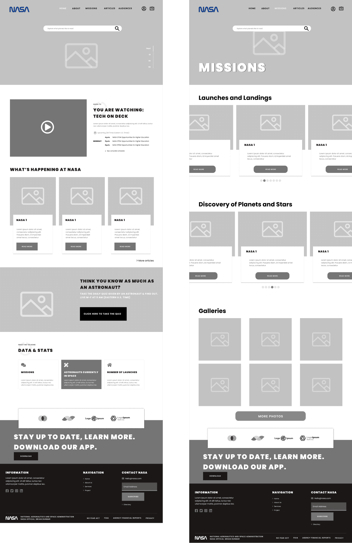
mid-fidelity wireframes
Taking the lo-fi wireframe sketches, we digitized them on Figma and added just enough information for users to be able to navigate through the pages and complete tasks we would present to them during usability testing. These mid-fidelity wireframes would help us focus on what needed to be improved in terms of the functionality of our design. We also created tablet and mobile versions to make sure that the design is responsive and effective across the different device screens that users would be accessing the website on.
usability testing
With our prototype completed, we started working on a test plan to guide the testing that would be conducted. We then recruited participants and conducted usability testing in order to see how users interact with our design and identify where improvements to the design can be made.
test objectives
Test if users can easily complete the tasks.
Observe the different paths users take to complete tasks.
Assess areas of improvement to improve the usability of the design.
tasks
Search for an article.
Bookmark an article and create an account.
Search for an upcoming NASA mission.
results
We conducted testing with 5 participants to make observations on how they interacted with the prototype and completed the tasks.
Method: In person
Participants: 5
Age range: Millennials
Average Time: 8 minutes
Task Completion Rate: 55%
Error-Free Rate: 60%
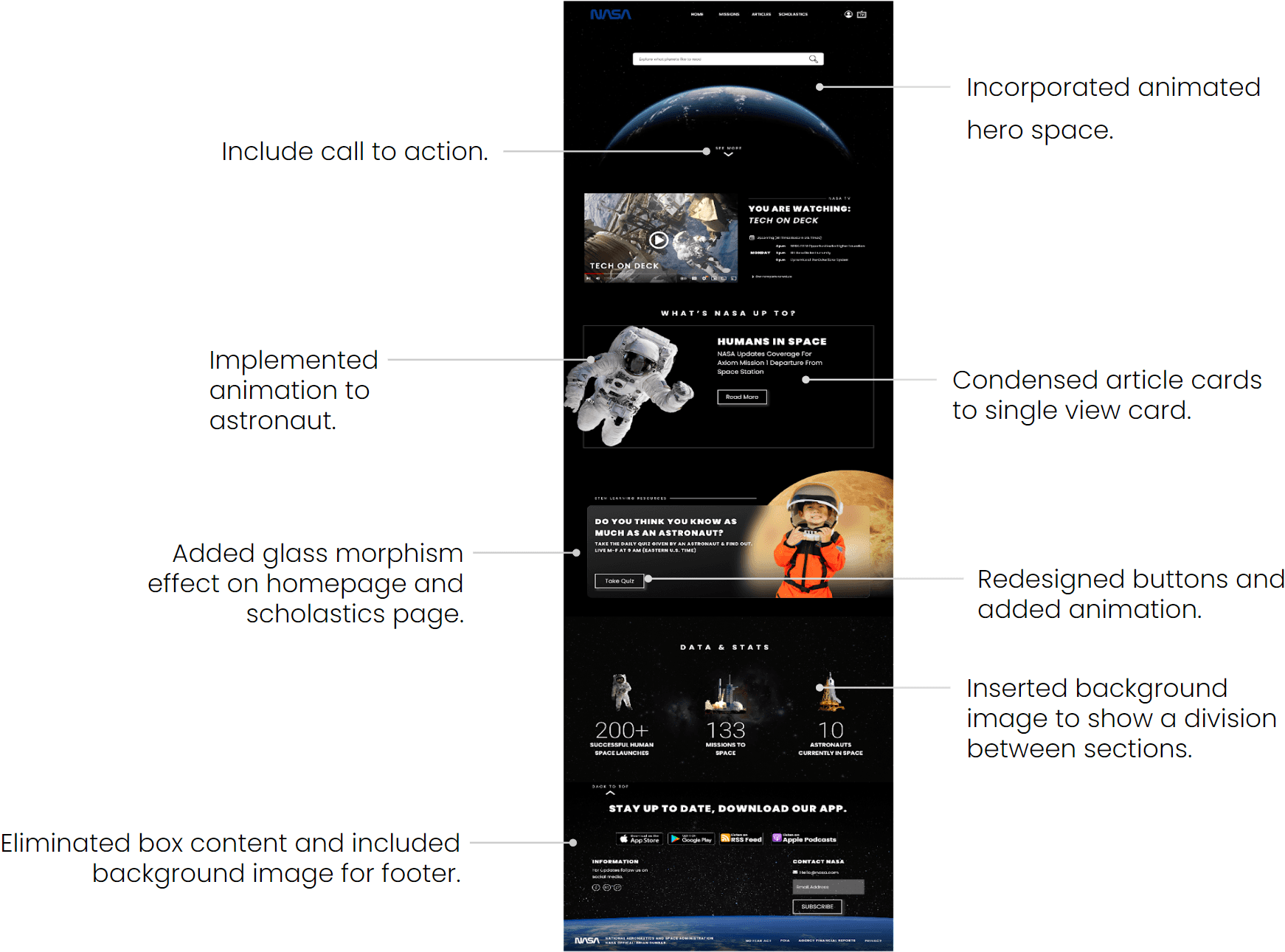
iterations
Leveraging insights gathered from our usability testing, we refined our design by implementing user-centered adjustments based on key recommendations, ensuring an improved and more intuitive user experience.
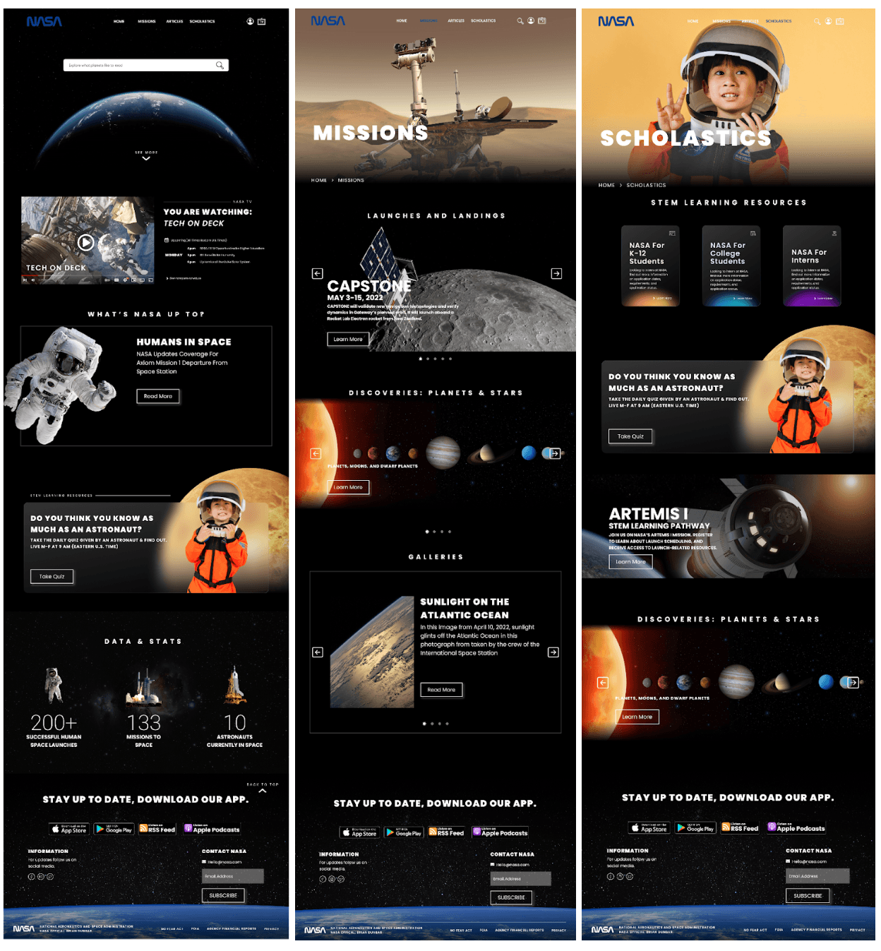
final prototype
Building on our revised wireframes, we developed high-fidelity designs and crafted a fully interactive final prototype, ensuring a polished and user-centered solution ready for stakeholder review and development handoff.
front end development
With our final prototype completed, we started working on the HTML code for the front-end development of the website. We used Visual Studio Code to write our code and then we would upload it to GitHub, where from there we could see how our actual website looked.
final thoughts & next steps
This project helped us learn the critical role that research and testing play in building a product that provides a solution to not only what the users think they want, but something that the user truly needs. If we were to push this project further, here are the next steps we would take:
Add Email: Implement ways for users to email themselves articles from the site, this will allow them to use any articles they really liked without having to go back to the website every time.
Live Video: Add a live video with astronauts for students to ask questions about science & tech.
Live Quiz: Create a full live quiz that updates daily and add micro animations to keep the user engaged.
Re-test: Now that we made revisions to our design and added the visual elements, we would like to test and validate the changes made and observe if any further improvements need to be prioritized.